The Energy Expended by a Market, 01/01/07
The Energy Expended by a Market, 01/01/07
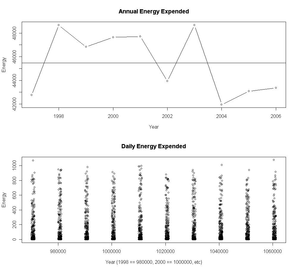
Two graphs of the energy expended by a market:

Two spectrographs analyzing market structure.
The top graph is an illustration of total energy output by year, the bottom a look at the energy expended (low-to-high) in the market each day.
Things to note:
- There have been three straight 'low energy' years, a volatility forecast (top graph)
- The annual energy never varies by more than 15% from year-to-year, a view into the constancy of market structure (top graph)
- The daily distributions appear very homogeneous year-over-year, another view into market structure (bottom graph)